Ask An Expert: Interview with Book Cover Designer Eric Labacz on Great Book Cover Design Trends in 2021 and Beyond
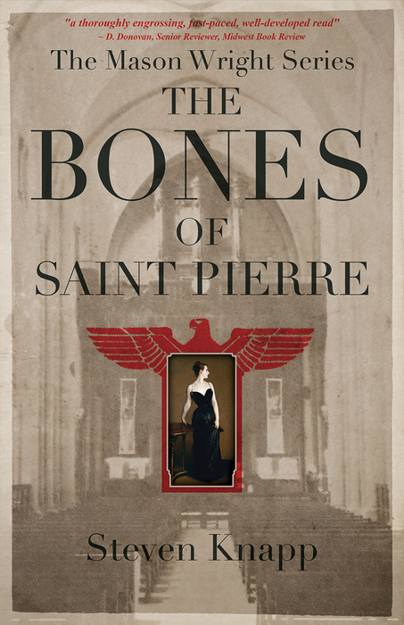
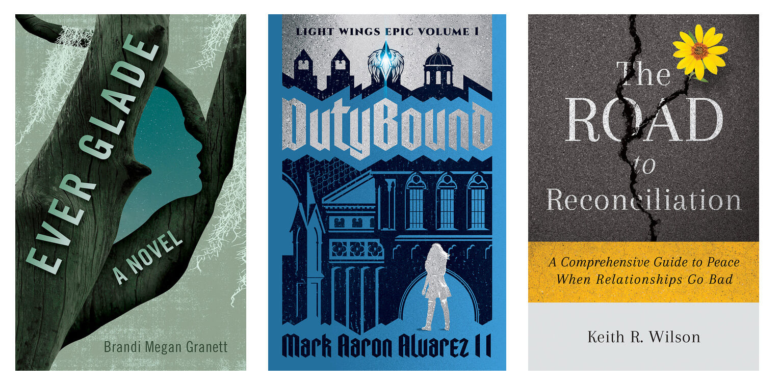
 What design elements contribute to a great book cover design? And what book cover design trends are popular in 2021 and beyond? Today on our Ask an Expert series, we’re sitting down with book cover designer Eric Labacz, who has created some of our most eye-catching and popular cover designs for our sister publishing company Books Fluent. Eric shares what key elements make for timeless, great book cover design, how genre should influence cover design, and some of the biggest cover trends we’re seeing right now.
What do you enjoy most about designing book covers?
Hands down the creative process that is involved in communicating certain details about a book in a unique way that urges readers to explore it further.
How long have you been a book cover designer? How did you get involved in this industry?
I have been designing covers for four years now. Prior to that, I worked for an agency and worked as a Senior Designer and Art Director in the toy, video and food packaging industries. In 2016, I decided to create a home-based studio and I was fortunate to connect with a local publisher a year into it. She started giving me cover projects and I instantly fell in love with cover design. I decided to put all my efforts into connecting with other publisher and author clients and, four years later, here we are.
In your opinion, what are the key elements of great book cover design?
Well, of course, you need the title, the subtitle if it pertains, and the author’s name, but the difference between a so-so cover and a great cover are how those elements are creatively arranged along with imagery and color. An interesting and engaging composition, a focal point that intrigues the reader and eye-catching colors are some elements of great covers.
Should a book’s genre influence a book’s cover design? If so, how does genre influence design?
 Absolutely. Readers who are looking for a new book expect to see certain design criteria which communicate the genre to them. If you were in the business of selling toasters, would you sell them in boxes that have a picture of a blender on them? Absolutely not. At the end of the day, you would have a lot of confused, angry customers. Similarly, you don’t want your non-fiction book on furniture making to have a romance-styled photo of embracing lovers on the cover and vice-versa.
Genre definitely affects the choices I make regarding the types of images, fonts and colors to use on a cover and how to arrange them. I need to get a reader to look at a cover and think, “Ok, this is scary, or this is funny or this is very suspenseful” and educate their decision-making. Going back to my favorite part of cover design, it is such a fun challenge to figure out how to communicate a genre using collectively understood images and meanings, but do it in a way that is different, clever and makes a statement.
What are some of the biggest trends you’ve noticed in book cover design in 2021?
One of the big ones I’ve noticed is what I call modern retro. There seems to be this love affair with combining all things 70s and 80’s with modern elements and I really dig it.
Another one of my favorites from the past few years is the trend of partially obscuring and affecting individual title letters as they interact with a cover image. I see that continue this year as cover designers continue to push the boundaries of how we read letter forms and I really enjoy it.
I have been noticing a lot of really bold, bright colors and patterns this year as well as the continuing trend of titles taking up the entire cover. SVG fonts have become really popular over the past few years and their use continues too. The SVG format allows for fonts to appear in different transparencies and I see them a lot on covers now. They have a hand painted or drawn feel.
The use of minimalism on covers will always be with us and I see designers play with it to keep it current.
I also see the continued trend of combining imagery with silhouetted forms. Designers are pushing how they interact with one another and some of the results are really interesting. Lastly, I have been really enjoying looking at new illustrations on covers and watching how digital illustration techniques continue to change. I see a lot of unique, gritty-brushed and textural illustration styles right now and I see it continuing as digital drawing software and apps continue to evolve. It’s some pretty exciting stuff.

Learn more about Eric Labacz, and see more of his awesome cover designs, at http://www.labaczdesign.com. Learn more about publishing your book with Books Fluent at https://booksfluent.com.

Chelsea is a copywriter, editor, publicist, and content creator at Books Forward, an author publicity and book marketing firm committed to promoting voices from a diverse variety of communities. From book reviews and author events, to social media and digital marketing, we help authors find success and connect with readers. Interested in what’s possible for your book sales and building readership? Check out our services, tell us your goals, and get a customized publicity campaign tailored just for you.


Corbie Mitleid says:
Eric designed my last book cover with a flawless understanding of what I needed and what the book was calling for. The first version was 95% there. How many projects get that kind of instantaneous understanding? The best I’ve ever worked with!