Author Nancy McCabe interviews cover designer Maryann Appel about the process of designing a book cover.
The cover of my young adult novel Vaulting Through Time was designed by Maryann Appel, who designs all of the book covers for CamCat Publishing. I was impressed by the range of designs that she creates — and, in particular, by the appealing simplicity of her covers that always manages to capture the essence of the stories. At the same time, if you look at her covers long enough, you realize that they are subtly layered and complex.
I’ve published eight books, with a ninth forthcoming, and the cover design process has varied with each press. In most cases, I’ve had very little, if any, input. I don’t think I’ve ever totally disliked a cover, but ultimately I’ve liked some better than others — and the one for Vaulting Through Time has proven to be one of my favorites. What I appreciated was that CamCat gives its authors an unusual amount of input — in fact, Maryann designed multiple covers and we discussed them at length before finally settling on the current one.
I was curious to know more about how Maryann works, and she was kind enough to talk to me about her process — in general and for Vaulting through Time.
The book cover brief
First, she says, she receives “a cover brief from production that outlines the book and includes the book description, the target audience, the category / genre, the tone of the cover, emotion of the book’s message, important story elements, elements to avoid, comparable titles and any preferences the author might have.”
I had filled out my own brief thoroughly. Some of the things I’d indicated that I thought were important were that my character is racially ambiguous and that she’s a gymnast who has developed a fear of throwing herself over the vault — and is eventually faced with doing just that to save her own life. Of course because the story is about time travel I thought that should be represented on the cover — but I also mentioned that I preferred that any figures on the cover not be too representational.
Understanding the book
After receiving the brief, Maryann says that her second step is to “read the first few chapters, a middle chapter, and last chapter of the book — this is important in capturing voice, tone and style.”
Third, she researches imagery. “Most of my book covers are designed using stock photography and illustration (no AI—all images are created by human beings),” she says. “I build composite images, which are made up of two or more photographs / illustrations and are combined to produce one image. Textures and effects are overlaid to create a unique image and then color is adjusted and blended for warmth or coolness.”


For the cover of Vaulting Through Time, she says, “I wanted to capture the adventure and mystery that the main character — a teenage girl coming of age — was about to embark on as she vaulted through several periods of time. The main elements this cover needed was a gymnast, a time machine or something depicting the passage of time, and a local setting.”
Preliminary designs
The publisher sent to me a variety of preliminary designs that Maryann had created.
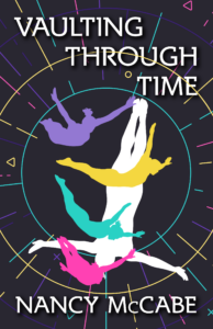
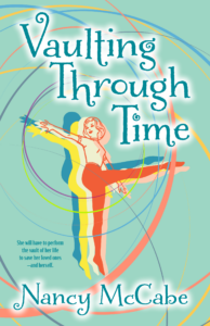

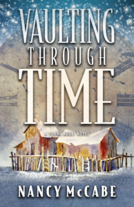
I was impressed by all of these covers, and liked things about each. In one case, though, Elizabeth appears to be on the beam rather than the vault. There were other small details that I wasn’t sure were quite right. But I was especially taken with the first one. I loved the colors and the image of the girl in profile. We discussed it further and Maryann came up with some variations on that cover.
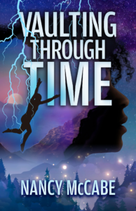
I liked these even better, especially the different ways that Maryann had worked in the wintry landscape in the background. But as we continued to discuss these, I realized that I had miscommunicated Elizabeth’s ethnicity. She appears African-American, which I feared would be misleading, since Elizabeth is actually part Asian. At this point, it was back to the drawing board.
Lots of decisions
Maryann explains some of the decisions as she elaborates on the third step of her process:
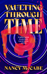
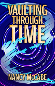
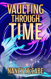
“Color is an important design element. Consider that color meanings and psychology reveal many symbolic elements or feelings of a story. The cover for Vaulting Through Time is composed mostly of cool colors — purples and dark blues — providing the wintery feel that is important to the story. The time travel orb is purple, illustrating otherworldliness and imagination. Purple thrives at the intersection of blue and red. As a powerful presence, purple can be somewhat intimidating. This bold hue embodies strength, prestige, and ability. It is often associated with mystery and magic, sparking creativity. In essence, the color purple encourages the mind, body, and soul to live in harmony. All important concepts to understanding the main character and what she struggles to overcome and the growth involved as she delves deeper and deeper into her past, present and future.
To balance the coolness of the color palette, the two gymnast figures are sky blue and pink. Sky blue is associated with the heavens, which make it a symbol of freedom and exploration. Sky blue often creates a sense of openness that encourages one to reach for their dreams. Pink is feminine, kind and comforting, full of warmth and compassion. Its friendly, playful spirit is calming and nurturing. These two colors capture the personality of the main character.”
Finalizing fonts
Maryann says that her fourth step is to “research fonts that reflect the book’s style and genre. For Vaulting Through Time, a simple sans serif font was chosen to stand out from the many layers of imagery on the cover. While the image is crucial in imparting a mood, tone and a sense of the story, the title and author name is the most important part of the cover and they need to be prominent. The use of yellow with an ombre effect allows the title and author’s name to jump out of all that purple and all those layers. Purple and yellow are hues opposite each other on the color wheel — complementary colors — which intensifies that tension.”
Finishing touches
For her fifth step, Maryann says, “Fonts and graphic filigree or borders are then layered in the mechanical. I try to integrate type with image so that both elements feel unified. Font color, textures and effects give depth and pizazz to the title, author name and tagline. In Vaulting Through Time, the gymnast figures are layered in a circular motion. This replicates the time travel orb, showing motion and the passage through time. The final piece is the layered winter scenery. It gradiates into the time travel orb depicts space. And it sets a specific time of year and the feelings that are associated with that season.”
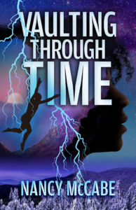
Soon I received the cover that Maryann is describing:
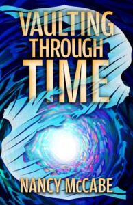
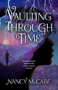
I had become so attached to the other one, my first reaction was dismay. This one was too abstract, had too much of a fantasy vibe. I went back and forth with my editor that morning. She told me that they were going to use this cover for the moment because of an upcoming deadline. But we could then revisit the decision down the line.
Final decisions
All that day, I kept clicking back to look at the new cover, and it kept growing on me. I loved the colors, the way the figure flips from pink to blue, from vaulting to flying. The energy of the circles and the way Maryann had incorporated the landscape in the background was also great. I saw something new every time I opened the file and looked at it. (And now, hearing Maryann’s rationale, I love it even more!)
I felt extremely fickle. But by the end of the day, I was not only completely sold on this cover, I was even more attached to it than I had been to the previous one.
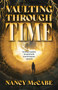
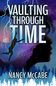
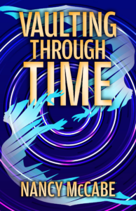
Late in the afternoon, my editor sent me another cover Maryann had designed:
I sheepishly responded that the other cover had grown on me. That I actually really loved it and was hoping we would go with it.
And that became my book’s cover, one that has received lots of compliments. I’m grateful to Maryann for this beautiful cover — and for sharing this information about her process with me.

Ellen Whitfield is senior publicist at Books Forward, an author publicity and book marketing firm committed to promoting voices from a diverse variety of communities. From book reviews and author events, to social media and digital marketing, we help authors find success and connect with readers.
Interested in what’s possible for your book sales and building readership? Check out our services, tell us your goals, and get a customized publicity campaign tailored just for you.